It’s a political slugfest which only reinforces the complexity of healthcare in this country
Get ready for the “Healthcare Reform Chart Wars,” brought to you courtesy of the two political parties. In the fight over the Obama Administration’s plan to reform healthcare, each side seems to be striving to offer up the most complex chart of how healthcare operates pre- and post-reform.
One chart (Republicans) skewers the complexity of the Democratic Party’s proposed reforms. The other chart (Democrats) demonstrates the convoluted intricacies of the existing American healthcare system. It appears that both Democrats and Republicans are engaged in this tussle with equal vigor and Dark Daily readers will enjoy the play-by-play of this unfolding farce.
Back on Wednesday, July 15, House Republicans, led by Rep. Kevin Brady (R-Texas), prepared a chart depicting how the healthcare reform legislation unveiled one day earlier by House Democrats would be a bureaucratic nightmare for the average American (and healthcare provider). However, maybe the Republicans are due a little credit for giving Americans their first detailed peek at the labyrinth to be created—if all the Democrats’ proposed 31 new federal programs, agencies, commissions, and mandates were to become reality.
Here is a small version of the healthcare reform chart released by the Republicans. It is titled: ORGANIZATIONAL CHART OF THE HOUSE DEMOCRATS’ HEALTH PLAN and is best viewed in full size by visiting the Republican Congressional Web Site (or paste this URL into your browser: http://docs.house.gov/gopleader/House-Democrats-Health-Plan.pdf).

This chart was prepared by House Republicans to demonstrate what the American healthcare system would look like if the Democrat’s house bill was to become law.
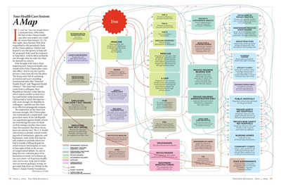
Not wanting the Republicans to win any chart-making awards unchallenged, The New Republic, a left-of-center news and commentary magazine, worked with the Henry J. Kaiser Family Foundation to produce a comparably convoluted chart depicting the complexity of the current healthcare system. And, yes, once again, it shows a nightmarish labyrinth. Reporting on the Republicans’ chart, The New Republic said, “It’s confusing, if colorful—full of boxes, lines, and all sorts of hard-to-say acronyms. Which, of course, is the point.”
Reproduced here is a reduced version of the “Your Health Care System: A Map.” This is definitely best viewed in full size. Go to this link at The New Republic (or paste the URL into your browser: http://www.tnr.com/yourhealthcaresystem.html).

From the Left, in support of Democractic proposals to reform healthcare, here is the chart published in The New Republic which shows of the existing healthcare system in the United States.
Most patients and physicians (along with laboratory directors and pathologists) already know that the current healthcare system is a complex muddle. Now the charts offered up by the political right and political left give us a clue that any health system reform legislation which passes is unlikely to be simpler than the status quo.
Thus, expect to be as challenging post-reform as it is now to connect spending with improved health outcomes. But then, isn’t it typical of politicians on both sides of the aisle to obfusticate their legislative solution to a problem? That way, it is tough for the public to accurately assign blame when things don’t work out and the problem ends up back in the laps of these same politicians!
Related Information:
Republicans: Web page for “Organizational Chart of the House Democrat’s Health Plan”
Democrats: America’s Affordable Health Choices Act Summary
Democrats: What’s in the Health Care Reform Bill for You?
Democrats: Health Reform at a Glance: Paying for Health Care Reform
The New Republic: Rube Goldberg Already Lives Here
The New Republic: Web page for “Your Healthcare System” Chart


